May

Securing Your Dream Home: A Guide to the HDB BTO Application Process in Singapore

May 22, 2024
The HDB Build-To-Order (BTO) scheme is a cornerstone program in Singapore, offering a gateway to affordable homeownership for many citizens and permanent residents (PRs). However, navigating the application process can seem daunting at first. This comprehensive guide demystifies the HDB BTO application process in Singapore, equipping you with the knowledge and steps to confidently embark on your homeownership journey.

Understanding the Significance: Why the HDB BTO Application Process Matters

The HDB BTO application process allows you to apply for flats under construction, with a typical waiting time of 2-4 years before key collection. These flats come with significant government subsidies, making them considerably more affordable compared to the private housing market. By understanding and following the application process, you can increase your chances of securing a comfortable and affordable HDB flat that aligns with your needs and budget. Compared to the often volatile and expensive private housing market in Singapore, the HDB BTO scheme offers a much more stable and predictable path to homeownership. The significant government subsidies attached to BTO flats can translate to hundreds of thousands of dollars saved, making a dream home a realistic possibility for a wider range of income groups, particularly young couples and middle-income families. This financial accessibility fosters social mobility and allows Singaporeans to invest in their future and build a strong foundation for their families.

Before You Begin: Eligibility Criteria for HDB BTO Applicants

Before diving into the application process, it’s crucial to ensure you meet the eligibility criteria set by the HDB. Here’s a breakdown of the key factors:
  • Citizenship and Age: Applicants must be Singapore Citizens (SCs) or Permanent Residents (PRs) who have held their PR status for at least 3 years (36 months) at the time of application. The minimum age requirement is 21 years old.
  • Family Nucleus: The HDB recognizes various family structures for BTO applications:
    • Married Couples: This is the most common scenario, and married couples can apply for any BTO project.
    • Fiancé/fiancée Scheme: Unmarried couples with a confirmed marriage registration date within 6 months of applying can utilize this scheme, but with limitations on project selection (typically non-mature estates).
    • Single Singapore Citizen (Singles) Scheme (from July 2024): Divorced or widowed individuals aged at least 35 can apply for a 2-room Flexi flat in non-mature estates under this upcoming scheme.
  • Income Ceiling: The combined monthly income of the applicants cannot exceed the income ceiling set by the HDB. This ceiling is reviewed and adjusted regularly.
  • Ownership of Other Properties: Applicants (and their spouses or co-applicants) cannot own any private property locally or overseas at the time of application or during the application process. Exceptions exist for certain circumstances, which we’ll explore in the documentation section.

Gathering Your Arsenal: Documents Required for HDB BTO Application

To ensure a smooth application process, ensure you have the following documents readily available:
  • Personal Identification Documents (ID/Passport): Valid Singpass for online applications and original IDs/Passports for verification.
  • Marriage Certificate (if applicable): Original marriage certificate for married couples applying jointly.
  • Income Documents: Latest CPF contribution statements or Income Tax Assessment Notices for the past 2 years for both applicants.
  • Other Supporting Documents (if applicable): Documents related to property ownership exceptions (explained later) or proof of eligibility under specific schemes (e.g., Married Child Priority Scheme).

Navigating the Application Journey: Step-by-Step Guide

The HDB BTO application process involves several crucial stages:
  • Registration for BTO Sales Launch: Register your interest for upcoming BTO launches on the HDB website. This ensures you receive notifications and application details when new BTO projects are announced.
  • Check Eligibility: Before applying, utilize the HDB’s online eligibility checker to confirm if you meet the basic criteria. This saves time and avoids potential disappointment.
  • Submit Application: During the application window for a specific BTO launch, submit your online application through the HDB website. Ensure all information is accurate and complete.
  • Balloting Process: The HDB conducts a computer ballot for all applications received within the stipulated timeframe. This ballot determines your queue position for selecting a flat.
  • Selection of Unit: Based on your balloting queue position, you will be given a specific date and time to select your preferred flat from available units within your chosen project.
  • Signing of Agreement for Lease: If you successfully select a flat, you will be required to sign the Agreement for Lease (APL) within the stipulated timeframe. This agreement formalizes your purchase of the HDB flat.
  • Payment of Fees: After signing the APL, you will need to pay the initial downpayment and other associated fees for your HDB flat.

Staying on Track: Important Dates and Timeline

Understanding key dates is crucial for a successful application:
  • Application Period: This is typically a one-week window announced alongside the BTO launch details. Don’t miss this window, as applications are not processed on a first-come, first-served basis.
  • Balloting Dates: The HDB conducts balloting within a few weeks after the application period closes. Specific dates are announced beforehand.
  • Unit Selection Period: Following the balloting, successful applicants will be notified of their queue position and allocated a specific date and time for flat selection. This selection typically occurs within a few months of the balloting.
  • Key Collection: The waiting time for key collection after selecting your flat can vary between 2-4 years, depending on the project’s construction progress. The HDB will keep you updated on the estimated completion date.

Making Informed Decisions: Factors to Consider During Application

While securing your dream HDB flat is exciting, consider these crucial factors before finalizing your application:
  • Location Preferences: BTO projects are spread across various locations in Singapore. Consider factors like proximity to work, family, amenities, and public transportation when choosing your preferred project.
  • Budget Constraints: While HDB flats are significantly more affordable than private properties, factor in additional costs like renovation, furnishing, and potential CPF housing grants you may be eligible for. Ensure your overall budget aligns with the chosen flat type and location.
  • Housing Needs: Consider the number of bedrooms and overall space required based on your current and future family size. HDB offers various flat types (e.g., 2-room Flexi, 3-room, 4-room) to cater to different needs.
  • Future Planning: Think about your long-term plans. Will the flat accommodate your needs as your family grows or career progresses? Consider the potential for upgrading to a larger HDB flat in the future.

Avoiding Pitfalls: Common Mistakes During the HDB BTO Application Process

A little preparation goes a long way. Here are some common mistakes to avoid:
  • Incomplete Documentation: Ensure you have all required documents properly scanned or uploaded before starting the online application. Missing documents can delay processing.
  • Missing Deadlines: Be mindful of all application deadlines, including the BTO launch registration, application window, and unit selection appointment. Missing deadlines can disqualify your application.
  • Incorrectly Filling Application Forms: Double-check all information entered in the online application forms for accuracy. Errors can lead to delays or even application rejection.
  • Not Understanding Eligibility Criteria: Familiarize yourself with the eligibility requirements before applying. Failing to meet the criteria can lead to disappointment and wasted effort.

Reaping the Rewards: Benefits of Applying for HDB BTO

The HDB BTO application process, while requiring careful planning and adherence to guidelines, offers numerous benefits:
  • Affordable Homeownership: HDB flats are significantly more affordable compared to the private housing market, making homeownership a realistic goal for many Singaporeans.
  • Government Subsidies: The HDB offers substantial subsidies on BTO flats, further reducing the financial burden for buyers.
  • Long Leasehold Tenure: HDB flats come with a 99-year leasehold tenure, renewable for another lease term, providing stability and long-term ownership.
  • Vibrant Communities: BTO projects are often strategically located near amenities and public transportation, fostering a sense of community and convenience.
By understanding the HDB BTO application process, gathering the necessary documents, and making informed decisions, you can increase your chances of securing your dream HDB flat and embarking on a rewarding homeownership journey in Singapore.

Additional Tips for Success

  • Regularly check the HDB website for upcoming BTO launches and application details.
  • Attend HDB informational sessions to gain a deeper understanding of the process and available schemes (e.g., Married Child Priority Scheme).
  • Consider seeking professional advice from a property agent specializing in HDB flats, especially for complex situations.
With careful planning and preparation, navigating the HDB BTO application process can be a smooth and successful experience. We wish you all the best in securing your dream HDB flat in Singapore!

Considering the Unforeseen: Special Cases and Appeals Process

While the outlined process caters to most applicants, there can be unforeseen circumstances. Here’s how the HDB addresses special cases:
  • Divorced/Widowed Individuals (Before July 2024): Currently, these individuals face limitations in applying for BTO flats. However, they can explore the resale market or consider the upcoming Single Singapore Citizen (Singles) Scheme for 2-room Flexi flats in non-mature estates (applicable from July 2024).
  • Non-traditional Family Types: The HDB does not currently recognize unmarried couples (beyond the Fiancé/fiancée scheme) or same-sex couples for BTO applications. However, they can consider the resale market or advocate for policy changes in the future.
  • Exceptions to Property Ownership: The HDB acknowledges situations where applicants might own another property due to inheritance or other circumstances. In such cases, applicants can submit an appeal explaining their situation and seeking consideration for eligibility. The HDB will evaluate each appeal on a case-by-case basis.

Conclusion: A Gateway to Homeownership Awaits

The HDB BTO application process can seem daunting, but with proper preparation and a clear understanding of the steps involved, you can confidently navigate the system and increase your chances of securing your dream HDB flat. Remember, the benefits of HDB BTO – affordability, government subsidies, long leasehold tenure, and vibrant communities – make it a highly attractive option for many Singaporeans seeking a comfortable and affordable place to call home.

Take the first step towards your dream home today. Contact Ovon-D and let’s embark on this exciting journey together. With our expertise and dedication to your satisfaction, we will ensure that your HDB BTO application process is smooth and successful, and that your new home is everything you’ve dreamed of and more. Your perfect home is within reach – let Ovon-D help you make it a reality.  
Your Guide to Eligibility: Navigating the HDB BTO Application Process in Singapore

May 22, 2024
The HDB Build-To-Order (BTO) scheme is a cornerstone program in Singapore, offering affordable housing options for citizens and permanent residents (PRs) to establish their roots and build a future. However, before embarking on your BTO journey, understanding the eligibility criteria is crucial. This comprehensive guide explores the essential requirements for applying for an HDB BTO flat in Singapore, along with additional considerations and resources to help you navigate the process smoothly.

Setting the Stage: An Overview of HDB BTO in Singapore
The Housing & Development Board (HDB) is a statutory board in Singapore responsible for public housing. The HDB BTO scheme allows eligible applicants to apply for flats under construction, with a waiting time of typically 2-4 years before key collection. This program offers significant subsidies, making homeownership a more attainable goal for many Singaporeans. Compared to the private housing market in Singapore, where property prices can soar to astronomical levels, the HDB BTO scheme offers a much more affordable path to homeownership. The significant subsidies provided by the HDB can translate to hundreds of thousands of dollars in savings, making a dream home a realistic possibility for many middle-income families and young couples starting out. The BTO scheme also plays a crucial role in fostering a strong sense of community in Singapore. BTO projects are often strategically located near amenities and public transportation, promoting a vibrant and convenient living environment for residents. As a result, HDB flats remain a highly sought-after option for many Singaporeans seeking a comfortable and affordable place to call home.

Demystifying Eligibility: Key Requirements for HDB BTO Applicants

Before diving into the application process, it’s vital to ensure you meet the eligibility criteria set by the HDB. Here’s a breakdown of the key factors:
  • Citizenship Status:
    • Singapore Citizens (SCs): SCs enjoy the most privileges when applying for HTO flats. They can apply for any BTO project, regardless of their location or marital status.
    • Permanent Residents (PRs): PRs must be at least 3 years old (36 months) to be eligible for a BTO flat. Additionally, they can only apply for flats in non-mature estates designated for PRs.
  • Age Requirement: Applicants must be at least 21 years old at the time of application.

  • Income Ceiling: The combined monthly income of the applicants cannot exceed the income ceiling set by the HDB. This ceiling is regularly reviewed and adjusted based on prevailing economic conditions.
  • Family Nucleus Criteria: The HDB recognizes various family structures for BTO applications:
    • Married Couples: This is the most common scenario. Married couples can apply for any BTO project, regardless of their location.
    • Fiancé/fiancée Scheme: Unmarried couples with a confirmed marriage registration date within 6 months of applying can apply under the Fiancé/fiancée scheme. However, they are only eligible for non-mature estates.
  • Ownership of Other Properties: Applicants (and their spouses or co-applicants) cannot own any private property locally or overseas at the time of application or during the application process. Exceptions exist for certain circumstances, which we’ll explore later.

Beyond the Basics: Additional Considerations for BTO Applicants

While meeting the basic criteria is essential, additional factors can influence your BTO application journey:
  • Priority Schemes: The HDB offers various priority schemes to give certain applicants an edge in the balloting process. These schemes include:
    • Married Child Priority Scheme (MCPS): Married couples where at least one partner is a Singapore Citizen child of an Singapore Citizen parent residing in a non-subsidised flat can enjoy shorter waiting times.
    • Parenthood Priority Scheme (PPS): Married couples with at least one child born before the BTO application deadline can benefit from this scheme.
    • Public Housing Priority Scheme (PHPS): Applicants who have been living in a rental flat for at least 5 years can apply under this scheme.

  • Special Cases: The HDB recognizes situations that may not fit the traditional family nucleus definition. Here’s how they are addressed:
    • Divorced or Widowed Individuals: Divorced or widowed individuals aged at least 35 years old can apply for a 2-room Flexi flat in non-mature estates under the Single Singapore Citizen (Singles) Scheme. This scheme will be extended to all project types (Standard, Plus, and Prime) from the second half of 2024.
    • Non-traditional Family Types: Currently, the HDB does not recognize unmarried couples (beyond the Fiancé/fiancée scheme) or same-sex couples for BTO applications.
  • Exceptions and Appeals Process: The HDB acknowledges that some applicants may face extenuating circumstances regarding property ownership. In such cases, applicants can submit an appeal explaining their situation and requesting consideration.

The Road to Homeownership: Conclusion and Resources

Understanding the eligibility criteria and additional considerations empowers you to navigate the HDB BTO application process effectively. The HDB BTO scheme presents a fantastic opportunity for many Singaporeans and PRs to achieve homeownership aspirations. By familiarizing yourself with the eligibility criteria, additional considerations, and available resources, you can make informed decisions and confidently navigate the application process. Remember, with careful planning and a good understanding of the system, you can take a significant step towards making your dream home a reality.  Choosing Ovon-D means choosing a partner who understands the intricacies of the HDB BTO process and the importance of creating a home that is uniquely yours. We believe that your home should be a sanctuary – a place where you can relax, unwind, and create lasting memories with your loved ones. Our comprehensive design services ensure that every aspect of your home is thoughtfully planned and expertly executed.

Creating Striking Contrasting Color Palettes: Captivating Designs that Pop

May 21, 2024
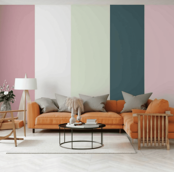
In the ever-evolving world of contemporary design, the power of color stands as a transformative force that can elevate our spaces and captivate our senses. But have you ever wondered how to harness the magic of contrasting color palettes to create designs that truly make an impact? In this comprehensive guide, we’ll delve into the realm of contemporary color schemes, exploring the secrets behind crafting striking contrasting color palettes that will leave a lasting impression.   What is the key to unlocking the true potential of modern color combinations and bold color schemes in your interior design and contemporary design projects? Join us as we uncover the principles of color theory and color psychology, equipping you with the knowledge to confidently navigate the world of design aesthetics and visual harmony.   Are you ready to discover the secrets behind creating captivating designs that pop with vibrant, contrasting hues? Get ready to unleash your creative potential and transform your spaces into visually stunning masterpieces.  

Key Takeaways

  • Explore the transformative power of striking contrasting color palettes in contemporary design.
  • Understand the principles of color theory and color psychology to unlock the full potential of bold color combinations.
  • Learn practical techniques for implementing harmonious and visually striking contrasting designs.
  • Discover inspirational examples and case studies that showcase the impact of effective color contrasts.
  • Overcome design challenges and find solutions to enhance your projects with impactful color contrasts.
 

Understanding the Power of Contrast in Contemporary Design

Contrast is a fundamental element in contemporary design, playing a crucial role in creating visually striking and captivating spaces. By exploring the impact of bold color contrasts, we’ll examine how they can instantly command attention, evoke emotional responses, and elevate the overall aesthetic of a design.  

Exploring the Impact of Bold Color Contrasts

The strategic use of contrasting color schemes can have a transformative effect on a design, evoking powerful emotions and creating a sense of visual harmony. Whether it’s the juxtaposition of complementary hues or the harmonious blend of analogous tones, color contrasts have the ability to captivate the viewer and leave a lasting impression.  

Highlighting the Importance of Balance and Harmony in Contrasting Color Palettes

While bold color contrasts can be visually striking, it’s essential to maintain a sense of balance and harmony within the design. By carefully considering the color theory and color psychology principles, designers can create contemporary color schemes that seamlessly blend together, resulting in a cohesive and impactful visual experience.  
Contemporary Color Schemes Modern Color Combinations Color Trends
Earthy Tones Vibrant Hues Minimalist Palettes
Muted Neutrals Complementary Palettes Jewel-Toned Schemes
Monochromatic Schemes Analogous Color Blends Pastel-Inspired Designs

Delving into Contrasting Color Theory

To fully harness the power of contrasting color palettes, it’s essential to understand the underlying principles of color theory and the psychological impact of color. By exploring the role of color psychology in creating visually striking contrasts, we can uncover how certain color combinations can evoke specific emotions and enhance the overall design narrative.

The Role of Color Psychology in Creating Visual Contrast

Color psychology plays a pivotal role in shaping the visual impact of contrasting color schemes. Certain color pairings can elicit strong emotional responses, influencing the way viewers perceive and interact with the design. Understanding the psychological associations and symbolic meanings of colors is crucial in leveraging visual harmony and design aesthetics to create captivating contemporary color schemes and modern color combinations.  

Tips for Selecting Effective Color Contrasts

When it comes to choosing effective color contrasts, there are several practical tips to keep in mind. Experimenting with complementary colors, which sit opposite each other on the color wheel, can create dynamic and attention-grabbing palettes. Alternatively, exploring analogous color combinations, which are adjacent on the wheel, can result in a more subtle yet harmonious contrast. By understanding the nuances of color forecasting and contemporary design trends, you can select bold color schemes that captivate and resonate with your audience.  

Balancing Boldness and Harmony in Contrasting Color Schemes

The art of balancing boldness and harmony within contrasting color schemes is paramount in creating visually compelling and cohesive designs. While bold, vibrant hues can instantly command attention, it’s essential to maintain a sense of visual harmony to ensure the overall design feels intentional and well-executed. Mastering the interplay between modern color palettes and earthy tones can result in striking contemporary designs that leave a lasting impression.  

Implementing Techniques for Contrasting Designs

With a solid understanding of color theory and the principles of contrast, we’ll delve into the practical implementation of techniques for creating captivating contrasting designs. From tips for pairing complementary or analogous colors to strategically utilizing contrast to draw the eye to focal points, this section will equip you with the necessary skills to transform your spaces.  

Tips for Pairing Contrasting Colors to Create Visual Interest

Mastering the art of pairing contrasting colors is key to crafting contemporary color schemes that captivate the senses. Whether you opt for bold, high-contrast combinations or explore more nuanced, harmonious palettes, the strategic use of contrasting hues can elevate the visual interest and impact of your designs. By understanding the principles of color theory and the psychological effects of different color pairings, you can curate color combinations that evoke specific moods and emotions, leaving a lasting impression on your audience.

Utilizing Contrast to Create Focal Points and Enhance Visual Impact

Contrast plays a vital role in guiding the viewer’s eye and creating focal points within your designs. By strategically employing contrasting colors, you can draw attention to specific elements, highlighting the most important features and creating a visually engaging narrative. Whether it’s a bold accent wall, a striking piece of furniture, or a captivating artwork, the strategic use of color contrast can amplify the visual impact and create a sense of visual harmony throughout the space.  

Incorporating Texture and Pattern to Amplify Contrasting Color Palettes

To further enhance the visual interest and impact of your contrasting color palettes, incorporating texture and pattern can be a game-changing strategy. By introducing varied surface finishes, tactile materials, and dynamic patterns, you can create depth, visual complexity, and a multidimensional aesthetic. This interplay of contrasting hues and textural elements can elevate the overall design, making it more visually striking and captivating to the senses.  
Color Combination Visual Impact Emotional Response
Blue and Orange Vibrant, energetic, and eye-catching Evokes a sense of optimism, creativity, and warmth
Green and Red Striking, bold, and attention-grabbing Conveys a sense of balance, harmony, and holiday cheer
Purple and Yellow Sophisticated, regal, and visually dynamic Elicits feelings of creativity, regality, and playfulness
Black and White Timeless, elegant, and visually impactful Evokes a sense of simplicity, sophistication, and drama
 

Showcasing Inspirational Examples

To further inspire and guide your design journey, this section will showcase a curated selection of real-world examples that highlight the power of contrasting color palettes in action. From striking interior designs to captivating branding campaigns, we’ll delve into case studies that demonstrate how designers have expertly utilized contrast to create visually memorable and impactful designs. These inspirational projects will provide valuable insights and practical takeaways to help you translate these concepts into your own creative endeavors.  

Real-world Examples of Striking Designs Using Contrasting Color Palettes

Explore a diverse array of contemporary design projects that have seamlessly incorporated bold, contrasting color schemes. From the vibrant and modern interiors of the new Ace Hotel in Los Angeles to the eye-catching branding of the acclaimed design agency Pentagram, these real-world examples showcase how the strategic use of color contrast can elevate the visual impact and overall aesthetic of a space or brand identity. Analyze the techniques employed by these designers to achieve stunning results and find inspiration to apply in your own creative work.  

Case Studies: Successful Branding with Contrasting Color Palettes

Dive into the world of branding and discover how leading companies have leveraged the power of contrasting color palettes to create visually striking and memorable brand identities. Examine case studies of prominent global brands, such as the bold color combinations used by Spotify and the harmonious yet contrasting hues employed by the iconic Coca-Cola brand. Uncover the strategies behind these successful branding efforts and gain insights into how you can incorporate similar principles to enhance the visual appeal and recognition of your own designs.  

Inspirational Projects: How Designers Utilize Contrast for Memorable Designs

Explore a curated selection of inspirational design projects that showcase the transformative impact of contrast. From the captivating interior designs of renowned architects like Faye Toogood to the innovative packaging solutions of leading consumer brands, these examples will demonstrate how designers have leveraged the principles of color theory and contrast to create visually striking, memorable, and impactful designs. Analyze the creative approaches, color palettes, and design techniques employed to gain a deeper understanding of how you can apply these insights to your own work and elevate the overall aesthetic and visual appeal of your creations.

Overcoming Design Challenges

While the pursuit of creating striking contrasting color palettes can be an exciting and rewarding journey, it’s not without its challenges. In this final section, we’ll address common struggles designers face when attempting to achieve the right balance in their contemporary color schemes and modern color combinations.  

Addressing Struggles with Achieving Balance in Contrasting Designs

Navigating the nuances of color harmony and visual harmony can be a delicate and intricate process. Designers often find themselves grappling with the challenge of striking the perfect balance between bold, contemporary design and a cohesive, visually pleasing aesthetic. Overcoming this hurdle requires a deep understanding of color theory and the ability to skillfully apply color psychology principles.  

Solutions for Enhancing Designs with Effective Color Contrasts

To enhance designs with impactful color contrasts, designers must explore innovative techniques and strategies. This may involve experimenting with unexpected modern color palettes, incorporating bold color schemes, or leveraging color forecasting trends to stay ahead of the curve. By adopting a flexible and creative mindset, designers can navigate the challenges of achieving balance and harness the transformative power of contemporary color combinations to craft visually stunning and captivating designs.

Discovering Pastel Color Combinations: Creating Serene and Charming Designs

May 21, 2024
In the ever-evolving world of contemporary design, pastel color combinations have emerged as a captivating trend, offering a soft, soothing, and charming aesthetic that resonates with modern sensibilities. But have you ever wondered what makes these delicate hues so alluring? And how can you leverage them to craft visually stunning and harmonious designs?   This section explores the allure of pastel colors, their unique qualities, and the ways in which they can be utilized to create a sense of tranquility and whimsy within your design projects. By understanding the psychology of pastel colors and their ability to evoke specific emotional responses, you’ll gain insights into their versatility and how they can be seamlessly integrated into a variety of design applications.  

Key Takeaways

  • Pastel colors have become increasingly popular in contemporary design, offering a soft and charming aesthetic.
  • Pastel hues have the ability to evoke feelings of calmness and whimsy, making them versatile in various design applications.
  • Understanding the psychology of pastel colors is key to leveraging their unique qualities and creating visually harmonious designs.
  • Pastel color combinations can be used to craft serene and charming designs that resonate with modern sensibilities.
  • Exploring the nuances of pastel color theory can help designers create impactful and visually stunning designs.
 

Delving into Pastel Color Theory

As we explore the captivating world of pastel colors, it’s crucial to understand the underlying principles of color theory and the psychological impact these soft, muted hues can have on design. Pastel colors, characterized by their delicate, soothing tones, possess the unique ability to evoke specific emotional responses and create a sense of visual harmony that is both calming and charming.  

The Psychology of Pastel Colors: Eliciting Feelings of Calmness and Whimsy

Pastel colors, with their gentle, almost ethereal quality, have the power to elicit feelings of tranquility and whimsy. These minimalist hues and chic shades are often associated with serenity, as they can instill a sense of peace and relaxation within the viewer. Additionally, the trendy tones and urban accents of pastel colors can contribute to a sense of playfulness and lightheartedness, making them a popular choice for designs that aim to capture a contemporary color scheme and a modern palette.

Tips for Creating Harmonious Pastel Color Palettes

Crafting harmonious pastel color palettes requires a delicate balance and understanding of color theory and design aesthetics. When selecting pastel hues, it’s essential to consider their visual harmony and how they can be combined to create a cohesive and visually appealing design. Experimenting with various fresh palettes and stylish colors can help designers discover the perfect blend of sophisticated hues that evoke the desired emotional response.  

Balancing Subtlety and Impact in Design with Pastel Hues

One of the unique challenges in working with pastel colors lies in finding the right balance between subtlety and visual impact. While these minimalist hues and chic shades can create a calming and charming atmosphere, they must be carefully integrated into the design to ensure they maintain their contemporary color scheme and modern palette without becoming overpowering or losing their distinctive character. By understanding the nuances of color psychology and design aesthetics, designers can skillfully weave trendy tones and urban accents into their creations, resulting in visually stunning and harmonious pastel-based designs.  

Implementing Techniques for Pastel Designs

As designers delve into the realm of contemporary design, the allure of pastel color combinations has become increasingly captivating. These soft, muted hues possess the power to evoke a sense of tranquility and delicacy, making them an invaluable asset in creating visually harmonious and charming designs. In this section, we will explore practical techniques for effectively pairing pastel colors, incorporating them to cultivate a whimsical and playful aesthetic, and leveraging texture and pattern to enhance the overall harmony of pastel color combinations.  

Tips for Pairing Pastel Colors to Evoke Tranquility and Delicacy

When it comes to crafting pastel-based designs, the key lies in striking the right balance between subtlety and impact. By carefully pairing complementary pastel hues, designers can create a sense of visual harmony that evokes a calming and delicate ambiance. Consider combining soft, muted shades of blues, pinks, and greens to establish a serene and tranquil color palette that resonates with modern contemporary design sensibilities. Experiment with nuanced variations within the modern color palettes to achieve a cohesive and sophisticated hues aesthetic that captivates the viewer’s attention.

Incorporating Pastels to Create a Sense of Whimsy and Playfulness

Beyond the realm of tranquility, pastel colors can also be leveraged to infuse designs with a touch of whimsy and playfulness. By juxtaposing unexpected pastel combinations or incorporating pastel accents into minimalist hues and chic shades, designers can cultivate a delightfully trendy tones and fresh palettes aesthetic. Utilize pastel hues as bold, eye-catching accents or as the primary color scheme to create a sense of urban accents and stylish colors that resonates with the target audience.  

Using Texture and Pattern to Enhance Pastel Color Combinations

To further elevate the impact of pastel color combinations, designers can incorporate strategic use of texture and pattern. The interplay of soft, muted pastel hues and tactile or visually rhythmic elements can produce a harmonious and captivating design aesthetics and visual harmony. Experiment with modern palette applications, such as textured wallpapers, embroidered fabrics, or subtle geometric patterns, to add depth and complexity to your contemporary color schemes and design aesthetics. By thoughtfully integrating these elements, designers can create a sense of visual interest and depth that truly showcases the allure of pastel color combinations.  

Showcasing Inspirational Examples

As designers and enthusiasts alike explore the captivating world of pastel color combinations, a wealth of real-world examples and case studies emerge that showcase the power of these soft, harmonious hues. From serene and charming designs to successful branding initiatives, the versatility of pastels in contemporary design aesthetics is evident.  

Real-world Examples of Serene and Charming Designs Using Pastel Color Combinations

In the realm of contemporary design, pastel color palettes have been embraced by a diverse array of creatives, resulting in visually stunning and calming projects. One standout example is the serene and minimalist interior design of a quaint cafe in Singapore, where modern color palettes of soft blues, pinks, and greens create a harmonious and visually harmonious ambiance. Another captivating design showcases the use of chic shades and trendy tones in a local fashion boutique, where pastel accents and urban accents come together to form a stylish and sophisticated retail experience.

Case Studies: Successful Branding with Pastel Color Palettes

The allure of pastel color combinations has also found its way into the world of branding, with several contemporary color schemes and modern palettes proving to be highly successful. One notable case study is the rebranding of a popular local skincare brand, which embraced a minimalist hues and fresh palettes to convey a sense of purity and whimsical charm. Another example showcases a thriving tech startup that has leveraged pastel tones and chic shades in its brand identity, resonating with its target audience and positioning the company as a trendy and sophisticated industry player.  

Inspirational Projects: How Designers Utilize Pastels for Calming and Whimsical Designs

The design community has also been captivated by the transformative power of pastel color combinations, as evidenced by a wealth of inspirational projects that seamlessly blend contemporary design with a sense of serenity and whimsy. A standout example is a series of children’s book illustrations that employ a modern color palette of soft pinks, blues, and greens, creating a charming and calming aesthetic that delights young readers. Another project showcases the use of pastel hues in a wellness-focused mobile application, where minimalist hues and fresh palettes work in harmony to promote a sense of tranquility and mindfulness.  
Design Inspiration Color Palette Aesthetic Impact
Serene Cafe Interior Soft blues, pinks, greens Calming and harmonious ambiance
Fashion Boutique Branding Pastel accents, urban tones Stylish and sophisticated retail experience
Skincare Brand Rebranding Minimalist hues, fresh palettes Conveys purity and whimsical charm
Tech Startup Brand Identity Pastel tones, chic shades Positioned as trendy and sophisticated
Children’s Book Illustrations Soft pinks, blues, greens Charming and calming aesthetic
Wellness App Design Minimalist hues, fresh palettes Promotes tranquility and mindfulness
 

Overcoming Design Challenges

While the allure of pastel color combinations is undeniable, designers may occasionally face challenges in creating the desired gentle and soothing designs. The delicate nature of these muted hues can make it tricky to achieve the perfect balance between visual interest and a calming aesthetic.  

Addressing Difficulty in Creating Gentle and Soothing Designs

One of the primary obstacles designers may encounter is the risk of pastel colors appearing too washed out or lacking in vibrancy. This can happen when the colors are not carefully curated or integrated within the overall design. To overcome this, it’s essential to have a deep understanding of color theory and the relationships between different pastel shades.  

Solutions for Enhancing Designs with Pastel Color Harmonies

By leveraging techniques such as strategic color blocking, subtle textural elements, and intentional use of neutrals, designers can elevate pastel color combinations and create visually striking, yet soothing, designs. Incorporating a touch of bolder accents can also help to add depth and balance, preventing the design from feeling too monotonous or one-dimensional.   Additionally, experimenting with different application methods, such as layering or blending pastel hues, can yield unexpected and captivating results. Designers who are willing to push the boundaries of traditional pastel palettes and embrace a more contemporary, yet still serene, aesthetic are often rewarded with designs that truly stand out in the competitive landscape.

Eclectic Interior Design: Blending Styles for a Unique Home Aesthetic

May 20, 2024
Have you ever walked into a room and felt instantly captivated by the harmonious blend of different styles, colors, and textures? That’s the magic of eclectic interior design. This design approach is all about creating a unique and personalized aesthetic by thoughtfully mixing various styles, periods, and influences. For homeowners in Singapore, where cultural diversity and modern living intersect, eclectic interior design offers a way to showcase personal taste and sophistication. But how do you achieve this balance without making your space look chaotic or mismatched? Let’s explore the key aspects of eclectic interior design, address common pain points, and discover how you can create a cohesive, budget-friendly, and personalized home aesthetic.

Key Takeaways

  • Achieving Cohesiveness and Balance: Tips on blending different styles harmoniously.
  • Managing High Costs: Strategies for budget-friendly eclectic design.
  • Ensuring Personalization: Making sure your space reflects your unique taste.
  • Professional Help: How limegreen-gull-606198.hostingersite.com can help bring your eclectic vision to life.
 

Achieving Cohesiveness and Balance

Understanding Eclectic Design: Eclectic interior design is characterized by the intentional and harmonious mixing of various styles and influences. The goal is to create a cohesive look that feels curated and balanced, rather than random or chaotic. It’s about finding the common thread that ties diverse elements together, whether it’s through color schemes, textures, or thematic elements. Challenges of Cohesiveness: One of the biggest challenges in eclectic design is ensuring that different elements work together harmoniously. Without careful planning, the mix of styles can easily become overwhelming and disjointed. Tips for Balance:
  1. Start with a Neutral Base: Use neutral colors for walls and large furniture pieces to create a cohesive backdrop. This allows bold and diverse elements to stand out without clashing.
  2. Create Focal Points: Choose a few standout pieces that draw attention and set the tone for the room. This could be a statement piece of art, a unique piece of furniture, or an eye-catching rug.
  3. Use Repeating Elements: Incorporate recurring colors, textures, or patterns to tie different styles together. For example, a common color palette can unify diverse pieces and create visual harmony.
Case Study: Imagine a living room with a neutral grey sofa, a vintage Persian rug, a modern coffee table, and a gallery wall of eclectic art. By using the neutral sofa as a base, the vibrant rug and art pieces become focal points, while the coffee table’s sleek lines balance the room’s traditional elements. This mix creates a space that feels both unique and cohesive.  

Managing High Costs

Budgeting for Eclectic Design: One common concern is the potential high costs associated with hiring designers and sourcing unique pieces. However, with thoughtful planning, it’s possible to create a stunning eclectic interior without overspending. Cost-Saving Strategies:
  1. Prioritize Key Pieces: Invest in a few high-impact items that define the space and mix them with more affordable accessories. For instance, a unique piece of art or a designer chair can set the tone for the room.
  2. DIY Elements: Incorporate DIY projects to personalize the space without breaking the bank. This could be anything from painting your own abstract art to repurposing vintage furniture.
  3. Second-Hand Treasures: Explore vintage shops, auctions, and online marketplaces for unique finds at lower prices. Sites like Etsy and Chairish offer a plethora of eclectic decor options that won’t blow your budget.
Value of Professional Help: While it might seem counterintuitive, hiring a skilled designer can actually save you money in the long run. Professionals can help avoid costly mistakes and ensure a cohesive outcome, making the investment worthwhile.  

Ensuring Personalization

Reflecting Personal Tastes: The beauty of eclectic design is its ability to reflect the homeowner’s unique tastes and personality. However, it’s important to ensure that the space doesn’t just look like a random mix of styles, but rather a thoughtful collection that tells a story. Personalization Tips:
  1. Showcase Collections: Incorporate personal collections (art, travel souvenirs, etc.) to add unique character to the space. These items not only tell a story but also add a personal touch that makes the space feel like home.
  2. Custom-Made Pieces: Invest in custom furniture or decor that reflects personal preferences and fits perfectly within the eclectic theme. This ensures that your space is truly one-of-a-kind.
  3. Meaningful Art and Decor: Choose art and decor items that resonate personally and add depth to the design. These pieces should evoke memories and emotions, making the space feel deeply personal.
Design Consultation: Consulting with an interior designer can help translate your personal tastes into a cohesive eclectic style. Designers can offer fresh perspectives and innovative ideas that you might not have considered.  

Conclusion

Creating a unique and cohesive eclectic interior design can be challenging, but with the right approach, it’s entirely achievable. By focusing on balance, managing costs effectively, and ensuring personalization, you can transform your home into a sophisticated and inviting space that reflects your personality and tastes. Imagine walking into your home and feeling a sense of pride and joy as you take in the harmonious blend of styles, the unique decor pieces, and the personal touches that make the space truly yours. This is the transformative power of a well-designed eclectic interior. Why Choose limegreen-gull-606198.hostingersite.com: At limegreen-gull-606198.hostingersite.com, we specialize in eclectic interior design, bringing your vision to life with expertise and creativity. Our team of experienced designers understands the nuances of blending different styles to create a cohesive and unique aesthetic. We handle everything from initial consultation to final execution, ensuring a seamless and stress-free experience. Contact us now for a free consultation and discover how we can help you achieve your dream eclectic interior.

Embracing Monochromatic Color Schemes: Achieving Minimalist Elegance

May 20, 2024
Dive into the simplicity and sophistication of monochromatic color schemes, elevating your space with effortless style and cohesion. In the realm of contemporary design, a captivating trend has emerged: the rise of monochromatic color schemes. These harmonious palettes have captivated designers and homeowners alike, offering a sophisticated and visually striking approach to crafting modern, minimalist spaces. But what is it about these captivating color combinations that have become so alluring?   Monochromatic color schemes, by their very definition, revolve around the use of a single hue and its various shades, tints, and tones. This streamlined approach to color allows for a sense of visual coherence and harmonious elegance, seamlessly blending elements within a space. Whether it’s the soft, soothing tones of a monochromatic gray scheme or the bold, dramatic impact of a monochromatic black and white palette, the appeal of these contemporary color trends lies in their ability to create a sense of visual harmony, minimalist sophistication, and timeless appeal.   In this article, we’ll delve into the world of monochromatic design, exploring the principles, techniques, and inspirational examples that showcase the power of these captivating color schemes. From understanding the foundations of monochromatic color theory to discovering practical tips for implementation, this comprehensive guide will equip you with the knowledge and inspiration to embrace the beauty of minimalist elegance through the lens of monochromatic design.  

Key Takeaways

  • Monochromatic color schemes offer a harmonious and visually striking approach to contemporary design.
  • These palettes create a sense of visual coherence and minimalist sophistication within a space.
  • Monochromatic design can be applied to a wide range of settings, from interiors to branding and beyond.
  • Mastering the principles of monochromatic color theory and leveraging color psychology can enhance the impact of these captivating schemes.
  • Incorporating texture, materiality, and strategic use of shades and tints can add depth and interest to monochromatic designs.
 

Unveiling Monochromatic Color Theory

Delving into the captivating realm of monochromatic color theory, we uncover the principles that make these striking palettes so visually compelling. At the core of monochromatic design lies the strategic use of a single hue and its various tints, shades, and tones, creating a harmonious and cohesive aesthetic that exudes modern elegance.  

Delving into the Principles of Monochromatic Color Palettes

Monochromatic color palettes are built upon the foundation of a single base color, which is then thoughtfully manipulated to achieve a range of subtle variations. By exploring the nuances of value, chroma, and undertones, designers can craft visually harmonious monochromatic schemes that captivate the eye and create a sense of visual balance.

Leveraging Color Psychology to Create Impactful Monochrome Designs

Understanding the psychological impact of color is essential when working with monochromatic palettes. Each hue carries its own unique set of emotional associations and symbolic meanings, which designers can skillfully harness to evoke specific moods and responses within the viewer. By aligning the chosen color with the desired design aesthetic and brand identity, monochromatic designs can make a powerful visual statement.

Balancing Contrast and Harmony in Monochromatic Schemes

The key to creating visually striking monochromatic designs lies in the delicate balance between contrast and harmony. Designers must carefully consider the interplay of light and dark tones, as well as the integration of accent colors and textures, to maintain a sense of visual interest and cohesion throughout the space. By mastering this balance, they can craft contemporary and minimalist environments that exude a sense of refined elegance.  

Implementing Techniques for Monochromatic Design

As the allure of contemporary design continues to captivate, the implementation of monochromatic design techniques has become a crucial aspect of creating visually striking and harmonious spaces. From selecting the right monochromatic palette to leveraging shades, tints, and textures, this section delves into the practical strategies that can help designers achieve the coveted minimalist elegance synonymous with modern color schemes.  

Tips for Selecting the Right Monochromatic Palette

Choosing the perfect monochromatic palette is the foundation for a successful design. Designers should carefully consider the desired mood, the overall contemporary design aesthetic, and the specific color trends that resonate with the project’s objectives. Experimenting with modern color palettes that feature a range of minimalist hues, from neutral tones to warm undertones and bold accents, can help create a visually harmonious and design aesthetic that evokes a sense of visual harmony.  

Creating Depth and Interest with Shades and Tints

To prevent a monochromatic design from feeling flat or one-dimensional, designers can leverage the power of shades and tints to add depth and visual interest. By incorporating shades (darker variations of the base color) and tints (lighter variations), designers can create a sense of layering and dimensionality within the contemporary color schemes. This technique not only enhances the overall modern palette but also helps to maintain a cohesive and captivating monochromatic style.  

Incorporating Texture and Material to Enhance Monochromatic Designs

Texture and materiality play a crucial role in elevating monochromatic designs. By thoughtfully incorporating a variety of textures, such as smooth, rough, or matte finishes, designers can add depth and visual interest to the minimalist hues and neutral tones that define the monochromatic aesthetic. Similarly, the strategic use of different materials, from natural wood to sleek metals or plush fabrics, can further enhance the overall design aesthetics and create a harmonious, visually compelling environment.  

Showcasing Inspirational Examples

As a testament to the enduring appeal of monochromatic design, this section showcases a diverse array of inspirational examples that demonstrate the power of these captivating color schemes in contemporary design. From elegant interiors that seamlessly incorporate monochromatic palettes to successful branding efforts and inspirational projects, these examples highlight the versatility and visual coherence that monochromatic design can achieve.

Real-world Examples of Elegant Interiors Using Monochromatic Schemes

Within the realm of interior design, monochromatic color schemes have become a hallmark of contemporary elegance and sophistication. Take, for instance, the stunning Industrial Chic Loft by acclaimed designer Emily Henderson, which showcases a harmonious blend of warm, neutral tones that create a serene and inviting atmosphere. Similarly, the Nature-inspired Retreat by Aerin Lauder effortlessly combines minimalist hues and natural textures to evoke a calming, nature-inspired ambiance.  

Case Studies: Successful Branding with Monochromatic Color Palettes

The impact of monochromatic color schemes extends beyond the realm of interior design, as evidenced by the success of several contemporary brands that have embraced these captivating palettes. The iconic Glossier brand, known for its minimalist aesthetic, has leveraged a harmonious monochromatic color scheme to create a cohesive and visually striking brand identity. Likewise, the Kinfolk magazine has garnered global acclaim for its modern, monochromatic design sensibility, which has become a hallmark of its distinctive brand personality.  

Inspirational Projects: How Designers Utilize Monochromatic Colors for Visual Coherence

Beyond the realms of interiors and branding, designers have consistently demonstrated the power of monochromatic color schemes in achieving visual coherence and harmony across a wide range of projects. The Minimalist Office Space by Gensler showcases how a carefully curated monochromatic palette can create a serene and productive work environment, while the Nature-Inspired Retreat by Olson Kundig seamlessly blends warm undertones and bold accents to establish a cohesive design aesthetic that seamlessly integrates with its natural surroundings.  
Project Designer Monochromatic Palette Design Aesthetic
Industrial Chic Loft Emily Henderson Warm Neutral Tones Elegant, Sophisticated
Nature-Inspired Retreat Aerin Lauder Earthy, Organic Hues Calming, Nature-Driven
Minimalist Office Space Gensler Monochromatic Grays Serene, Productive
Nature-Inspired Retreat Olson Kundig Warm Undertones, Bold Accents Harmonious, Cohesive
 

Overcoming Design Challenges

As designers delve into the world of contemporary color trends and modern color palettes, they may occasionally encounter challenges when working with monochromatic design. However, these obstacles can be overcome with a deep understanding of design aesthetics and the application of practical solutions.  

Addressing Common Misconceptions about Monochromatic Color Schemes

One of the primary hurdles in monochromatic design is dispelling the common misconception that it lacks visual harmony and contemporary color schemes. On the contrary, a well-executed modern palette can achieve a stunning sense of minimalist hues and neutral tones with strategic use of warm undertones and bold accents.  

Solutions for Creating Cohesive Designs with Monochromatic Palettes

To create truly cohesive monochromatic style designs, designers can leverage a variety of techniques. This includes carefully selecting shades and tints within the chosen color scheme, incorporating textural elements to add depth and interest, and strategically placing bold accents to enhance the overall visual harmony. By mastering these solutions, designers can unlock the full potential of contemporary design using monochromatic palettes.  
Technique Description Benefits
Shade and Tint Variation Incorporating different shades and tints of the same core color to create depth and visual interest. Adds complexity, prevents a flat or monotonous appearance, and enhances the minimalist hues.
Textural Elements Integrating various materials and textures within the monochromatic palette to add visual appeal and tactile experiences. Breaks up the visual monotony, creates a sense of visual harmony, and elevates the overall contemporary design.
Strategic Accent Placement Carefully positioning bold accents, such as pops of color or distinct design features, within the monochromatic scheme. Adds visual interest, highlights focal points, and enhances the overall design aesthetics of the space.
 

Conclusion

As we’ve explored throughout this insightful journey, monochromatic color schemes have emerged as a captivating trend in contemporary design, offering designers a harmonious and visually striking approach to creating modern, minimalist spaces. The allure of these captivating palettes lies in their ability to infuse a sense of elegance and sophistication, while seamlessly blending the principles of color theory and psychology.  

Achieving Minimalist Elegance: Enhancing Designs with Monochromatic Color Schemes

By embracing the versatility and timeless appeal of monochromatic color schemes, designers can elevate their creations to new heights of visual coherence and impact. Whether it’s the soothing allure of neutral tones, the bold statement of a single hue, or the harmonious interplay of shades and tints, these captivating palettes have the power to transform ordinary spaces into extraordinary ones, evoking a sense of minimalist elegance that resonates with modern design enthusiasts.   As we bid farewell to this exploration of monochromatic design, it’s clear that these captivating color schemes will continue to hold a prominent place in the world of contemporary design. By leveraging the principles of color theory, color psychology, and visual harmony, designers can harness the full potential of monochromatic palettes to craft modern color schemes, minimalist hues, and nature-inspired masterpieces that captivate and inspire audiences.

Harnessing Bold and Vibrant Colors: Making Your Designs Stand Out

May 20, 2024
Infuse energy and personality into your surroundings by embracing bold and vibrant hues, unleashing your creativity in home design. Are you tired of playing it safe with muted palettes? In the realm of contemporary design, a bold and vibrant color renaissance is taking the world by storm. Harnessing the power of dynamic hues can elevate your designs, captivating and inspiring your audience. But how can you harness this chromatic magic to make your work truly stand out?   Contemporary design is embracing a new era of bold and vibrant colors, moving away from the subdued palettes of the past. From rich jewel tones to striking color combinations, this section will explore the transformative impact of using bold colors in your designs. Discover how to leverage contemporary color schemes, modern color palettes, and trendy hues to create sophisticated color combinations, chic color trends, and chromatic design inspiration.   Whether you’re a seasoned designer or a creative newcomer, unraveling the secrets of minimalist color harmony, edgy color aesthetics, and curated color stories can help you elevate your contemporary design to new heights. Immerse yourself in the world of color trends, color theory, and color psychology to unlock the true power of design aesthetics and visual harmony.  

Key Takeaways

  • Explore the bold and vibrant color renaissance in contemporary design
  • Discover how to leverage dynamic hues to captivate and inspire your audience
  • Uncover the secrets of modern color palettes and sophisticated color combinations
  • Dive into the world of color theory and color psychology to elevate your designs
  • Learn how to create chromatic design inspiration and curated color stories
 

Unveiling Bold Color Theory

Harnessing the power of bold and vibrant colors in design is not merely a matter of aesthetic preference – it’s a deliberate strategy rooted in the principles of color theory and color psychology. By understanding the psychological impact of different hues, designers can strategically wield color to capture attention, evoke emotions, and create visually striking designs that resonate with their audience.

Delving into the Psychology of Bold and Vibrant Colors

Bold, saturated colors like jewel tones and earthy tones are known to elicit strong emotional responses. For instance, vibrant reds can convey passion and energy, while deep blues may evoke a sense of calmness and stability. Conversely, pastel hues tend to have a more soothing, calming effect, making them ideal for creating a sense of tranquility and balance.

Tips for Using Bold Colors Effectively to Capture Attention

When it comes to using bold colors, the key is to strike a balance between attention-grabbing vibrancy and harmonious design. Bold color blocking techniques, for example, can create a striking visual impact, while the strategic use of monochromatic color schemes can lend a sophisticated, cohesive look to a design. The goal is to leverage color in a way that captivates the viewer without overwhelming the overall aesthetic.  

Balancing Vibrancy and Harmony in Design

Achieving visual harmony is crucial when working with bold, vibrant colors. Designers must carefully consider the relationships between colors, experimenting with complementary hues, analogous palettes, and even unexpected color combinations to create designs that are both visually striking and aesthetically pleasing. By understanding the principles of design aesthetics, designers can harness the power of bold color to elevate their work and captivate their audience.  

Implementing Techniques for Bold and Vibrant Designs

Translating bold color theory into practical design applications is the focus of this section. Designers will learn proven techniques for selecting impactful color combinations, creating depth and contrast through vibrant hues, and using bold colors to draw the viewer’s eye and create focal points.  

Tips for Choosing Bold Color Combinations

When it comes to contemporary color schemes and modern color palettes, bold color blocking can be a game-changer. Explore sophisticated color combinations and chic color trends that seamlessly blend trendy hues and earthy tones or pastel hues and jewel tones. Experiment with chromatic design inspiration to create minimalist color harmony and curated color stories that capture the essence of contemporary design and color trends.  

Creating Contrast and Depth with Bold and Vibrant Colors

Leverage the power of edgy color aesthetics to inject depth and dynamism into your designs. Play with monochromatic color schemes or bold color blocking to create visual interest and guide the viewer’s eye. By strategically incorporating vibrant hues, you can build layers of depth and contrast that make your designs truly stand out.  

Using Bold Colors to Create Focal Points and Visual Interest

Harness the captivating nature of bold and vibrant colors to draw the viewer’s attention and create compelling focal points. Experiment with chromatic design inspiration and curated color stories to craft contemporary designs that showcase chic color trends and modern color palettes. Strategically placed bold color blocking can instantly elevate the visual interest and impact of your work.  

Showcasing Inspirational Examples

To further inspire and guide designers, this section will showcase real-world examples of memorable designs that have effectively harnessed the power of bold and vibrant colors. By examining case studies and inspirational projects, readers will gain a deeper understanding of how to apply these contemporary design principles in their own work.

Real-world Examples of Memorable Designs Using Bold and Vibrant Colors
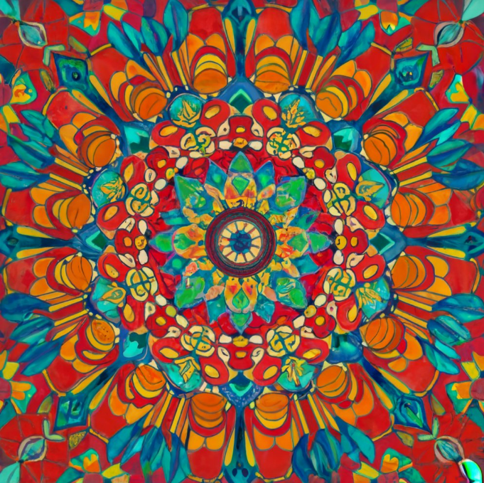
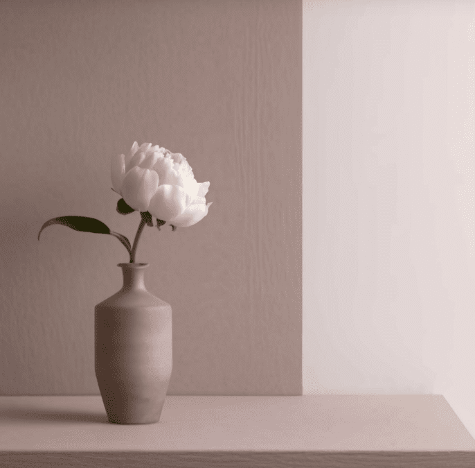
From the striking chromatic design inspiration of Scandinavian color trends to the captivating chic color trends found in modern interior design colors, this section will explore a curated collection of designs that have successfully incorporated bold color blocking and jewel tones to create truly memorable and impactful visuals.  

Case Studies: Successful Branding with Bold Color Palettes

Delving into the world of contemporary design, we’ll examine case studies of brands that have leveraged curated color stories and trending color palettes to establish a strong, chromatic design inspiration that resonates with their target audience. These examples will showcase how bold and vibrant colors can be strategically employed to create a chic color trends that captivates and connects with consumers.  

Inspirational Projects: How Designers Utilize Bold and Vibrant Colors for Impactful Designs

Finally, we’ll explore a selection of inspirational projects that demonstrate the transformative power of bold and vibrant colors in design. From the use of jewel tones to create a sense of luxury and sophistication to the implementation of bold color blocking to draw the viewer’s eye, these projects will inspire designers to push the boundaries of color trends and create designs that truly stand out.  

Overcoming Design Challenges

While the bold use of color can be a powerful design tool, it can also present unique challenges for designers. Many creatives may feel hesitant about using vibrant hues, fearing they might come across as unbalanced or disharmonious. However, with the right approach and a solid understanding of color theory, these concerns can be effectively addressed.

Addressing Fear of Using Bold Colors Incorrectly

The key to overcoming the fear of using bold colors incorrectly lies in developing a deeper appreciation for color theory and the psychology behind different hues. By understanding how colors interact with one another, designers can make more informed decisions and create visually striking yet harmonious compositions. Exploring color palettes, color-blocking techniques, and the emotional impact of various shades can help build confidence in incorporating bold and vibrant colors into their designs.  

Solutions for Creating Cohesive Designs with Bold and Vibrant Color Palettes

To achieve a cohesive design with bold and vibrant color palettes, designers can employ a range of strategies. Curating a carefully selected color story, incorporating elements of minimalist color harmony, and drawing inspiration from contemporary color trends and Scandinavian design aesthetics can all contribute to the creation of visually stunning and coherent designs. Additionally, mastering the art of balancing contrasting hues and leveraging the principles of design aesthetics can help designers overcome the challenges of using bold colors effectively.

Exploring Neutral Color Palettes: Unlocking Timeless Elegance

May 19, 2024
Embrace the understated elegance of neutral tones, exploring their versatility and timeless appeal in home decor and design. In the ever-evolving landscape of contemporary design, the allure of neutral color palettes has become increasingly prominent. Neutral tones, such as shades of white, gray, beige, and taupe, have long been celebrated for their ability to create a sense of timeless elegance and understated sophistication. These versatile hues have the power to transform any space, imbuing it with a refined and harmonious aesthetic that transcends fleeting trends.   But what if neutral colors could do more than just create a soothing ambiance? Could they be the key to unlocking a truly captivating and visually arresting design? As we delve into the world of neutral color palettes, we’ll uncover the hidden potential of these seemingly simplistic hues and explore how they can be leveraged to elevate contemporary interior hues and fresh color schemes.  

Key Takeaways

  • Neutral colors are versatile and can create a timeless, elegant aesthetic.
  • Understanding the psychology of neutral colors is crucial for designers to harness their transformative power.
  • Implementing neutral color palettes requires strategic techniques to achieve visual harmony and depth.
  • Real-world examples showcase the versatility and impact of neutral color schemes in both interiors and branding.
  • Overcoming common misconceptions and balancing neutrals with pops of color can unlock the full potential of these design staples.
 

Delving into Neutral Color Theory

Neutral color theory explores the fundamental principles that govern the use of these versatile color theory hues in design. By understanding the color psychology behind neutral colors and their impact on the human psyche, designers can cultivate a deeper appreciation for their transformative power.

Understanding the Psychology of Neutral Colors

Neutral colors, such as shades of design aesthetics white, gray, beige, and taupe, are often associated with a sense of calm, sophistication, and timelessness. These hues have the ability to create a harmonious and visual harmony soothing environment, allowing the eye to rest and the mind to focus on the essential elements of a space.  

The Role of Neutrals in Creating Visual Harmony

Neutral colors play a crucial role in contemporary color schemes establishing visual harmony within a design. By serving as a neutral backdrop, they allow other design elements, such as textures, patterns, and pops of minimalist color themes color, to take center stage without overwhelming the senses. This creates a balanced and cohesive aesthetic that is both visually appealing and emotionally calming.  

Balancing Warm and Cool Tones in Neutral Color Palettes

Crafting a well-balanced contemporary interior hues neutral color palette requires a careful consideration of both warm and cool tones. Warm neutrals, such as beige and taupe, can create a cozy and inviting atmosphere, while cool neutrals, like gray and white, can lend a more modern and clean color motifs refined aesthetic. By striking the right balance between these contrasting tones, designers can achieve a harmonious and visually captivating interior space.  

Implementing Neutral Color Palettes Techniques

As designers navigate the contemporary design landscape, the strategic implementation of neutral color palettes becomes paramount. Carefully selecting the right neutral shades, creating contrast and depth, and leveraging texture and patterns can elevate any space, imbuing it with a timeless elegance that transcends fleeting trends.  

Tips for Choosing the Right Neutral Shades

When it comes to contemporary color schemes and modern color palettes, the nuances of neutral hues play a crucial role. Designers must consider factors such as undertones, lighting conditions, and the overall design aesthetics of the space to determine the most suitable neutral colors. By striking a harmonious balance between warm and cool tones, they can create clean color motifs that effortlessly flow throughout the contemporary interior hues.

Creating Contrast and Depth with Neutral Colors

Neutral color palettes are not merely monochromatic backdrops; they offer endless opportunities to infuse depth and visual interest. Designers can leverage trendy color combinations and chic color trends to introduce subtle contrasts, whether through the strategic placement of modern color palettes or the thoughtful integration of updated color palettes. This approach helps to prevent a flat or one-dimensional contemporary design, while maintaining the cohesive and minimalist color themes that define the allure of neutral-driven spaces.  

Using Texture and Patterns to Enhance Neutral Color Schemes

To truly elevate neutral color schemes, designers often turn to the strategic use of texture and patterns. By incorporating fresh color schemes and current paint colors within a neutral foundation, they can create visual depth and tactile interest. This technique not only adds layers of complexity to the contemporary interior hues but also helps to prevent a monochromatic or flat appearance, ensuring that the design aesthetics remain engaging and captivating.

Showcasing Inspirational Examples

Exploring real-world examples of elegant interiors, successful branding campaigns, and inspirational design projects showcases the versatility and timeless appeal of contemporary design and clean color motifs. These examples highlight how designers masterfully blend minimalist color themes and chic color trends to create visual harmony and contemporary interior hues that captivate the senses.  

Real-world Examples of Elegant Interiors Using Neutral Color Palettes

From the luxurious lobby of the Waldorf Astoria Singapore, where contemporary design and design aesthetics seamlessly converge, to the tranquil Muji Hotel in Tokyo, which embodies the essence of minimalist color themes and clean color motifs, these real-world interiors showcase the power of neutral color palettes to evoke a sense of timeless elegance and visual harmony.  

Case Studies: Successful Branding with Neutral Color Schemes

The appeal of neutral color schemes extends beyond interior design, as evidenced by the success of global brands like Apple and Everlane. These companies have masterfully leveraged contemporary color schemes and chic color trends to create cohesive and memorable brand identities that resonate with consumers worldwide.  

Inspirational Projects: How Designers Utilize Neutral Colors for Impactful Designs

From the serene and calming interiors of the Aesop store in Singapore to the striking visual identity of the Kinfolk magazine, designers have consistently demonstrated their ability to harness the power of contemporary interior hues and clean color motifs to craft design aesthetics that are both visually captivating and emotionally resonant.

Overcoming Design Challenges

While the allure of neutral color palettes is undeniable, designers may occasionally face challenges in effectively incorporating these versatile hues into their projects. By addressing common misconceptions and providing practical solutions, they can unlock the full potential of neutral color schemes and create cohesive, visually harmonious designs.  

Addressing Common Misconceptions about Neutral Color Palettes

One of the most persistent misconceptions about neutral colors is that they are inherently boring or lacking in personality. On the contrary, skilled designers can leverage the subtlety and sophistication of neutral tones to create spaces that exude a sense of timeless elegance and understated charm. By challenging this preconception, designers can explore the nuances and depth of neutral palettes, unleashing their transformative power.  

Solutions for Creating Cohesive Designs with Neutrals

Designing with neutral colors requires a keen eye for balance and a deep understanding of color theory. Designers must carefully consider the interplay of warm and cool tones, as well as the strategic use of texture and patterns, to prevent a neutral-dominant space from feeling flat or one-dimensional. By mastering these techniques, they can craft cohesive designs that seamlessly integrate neutral hues, fostering a sense of visual harmony and sophistication.  

Balancing Neutral Color Palettes with Pops of Color

While neutral color schemes offer a timeless foundation, strategically incorporating pops of vibrant color can add depth, contrast, and visual interest to a design. By juxtaposing neutral tones with carefully selected accent colors, designers can create dynamic and visually compelling spaces that strike a balance between understated elegance and bold, contemporary flair. This approach allows them to explore the full range of design possibilities and cater to the evolving preferences of their target audience.

Exploring Safer Alternatives to Formaldehyde

May 19, 2024
Elevate your corporate celebrations with insider tips and exclusive venues, ensuring a memorable anniversary event in the heart of Singapore. In today’s world, formaldehyde is a ubiquitous chemical found in a vast array of products, from building materials to household items. While its versatility is undeniable, the potential health risks associated with formaldehyde exposure have sparked a growing demand for safer alternatives. As the global focus on eco-friendly and sustainable practices continues to intensify, the need to explore formaldehyde substitutes, non-toxic preservatives, and eco-friendly materials has become increasingly crucial, particularly in the realm of green building and sustainable construction.   But what if there was a way to create a healthier living environment without compromising on the functionality and aesthetics of our homes and buildings? The answer lies in the innovative solutions that are transforming the construction industry, offering a future where low-VOC products, formaldehyde-free insulation, and biobased composites are the new norm.   Are you ready to uncover the secrets to a healthy home and a sustainable future? Join us as we embark on a journey to explore the groundbreaking alternatives that are reshaping the way we build and live.  

Key Takeaways

  • Formaldehyde is a commonly used chemical that poses health risks, leading to the need for safer alternatives.
  • Alternatives to formaldehyde are becoming increasingly important, particularly in the realm of green building and sustainable construction.
  • Non-toxic preservatives and eco-friendly materials are emerging as viable substitutes for formaldehyde-based products.
  • Low-VOC products and formaldehyde-free insulation are examples of the growing availability of green building supplies.
  • Advancements in manufacturing processes and adherence to regulatory standards are promoting the use of safer, sustainable materials.

Formaldehyde Substitutes

As the demand for eco-friendly materials and sustainable construction continues to grow, the search for formaldehyde substitutes has become increasingly important. Formaldehyde, a commonly used chemical in a variety of products, has been linked to health concerns, driving the need for innovative non-toxic preservatives and green building supplies.

Non-toxic Preservatives: Utilizing Natural Substitutes for Formaldehyde

Traditional formaldehyde-based preservatives are being replaced by natural alternatives that offer similar performance without the associated health risks. These non-toxic preservatives include plant-based extracts, essential oils, and biobased composites that provide effective preservation while promoting low voc products and a healthier indoor environment.  

Eco-friendly Materials: Choosing Renewable and Sustainable Alternatives

The construction industry is increasingly embracing renewable and sustainable alternatives to traditional building materials containing formaldehyde. These eco-friendly materials include non-formaldehyde resins, eco-friendly adhesives, and formaldehyde-free insulation, all of which contribute to the creation of green building materials and a healthy home for occupants.  
Formaldehyde Substitutes Benefits
Plant-based Extracts Natural, non-toxic preservatives with effective antimicrobial properties
Essential Oils Aromatic, sustainable alternatives that provide preservation and odor control
Biobased Composites Renewable materials that offer superior performance and environmental sustainability
Non-formaldehyde Resins Formaldehyde-free binders for wood-based products and building materials
Eco-friendly Adhesives Sustainable, low-VOC options for bonding and sealing in construction
Formaldehyde-free Insulation Safer, healthier insulation solutions that prioritize indoor air quality

Green Building Supplies

As the demand for eco-friendly and sustainable construction materials continues to grow, the availability of green building supplies has also been on the rise. These innovative products offer alternatives to traditional formaldehyde-based materials, catering to the needs of environmentally conscious homeowners and builders alike. Two key areas that have seen significant advancements are low-VOC products and natural wood finishes.  

Low VOC Products: Opting for Materials with Reduced Volatile Organic Compounds

Volatile organic compounds (VOCs) can be harmful to both human health and the environment. Fortunately, the market has responded with a wide range of low-VOC products, including paints, adhesives, and sealants, that provide formaldehyde substitutes and non-toxic preservatives. These eco-friendly materials and green building supplies not only reduce exposure to harmful chemicals but also contribute to improved indoor air quality, making them a popular choice for sustainable construction and healthy home products.  

Natural Wood Finishes: Embracing Finishes That Do Not Emit Harmful Chemicals

In addition to low-VOC products, the green building industry has also seen a growing trend towards natural wood finishes that do not emit harmful formaldehyde or other volatile organic compounds. These eco-friendly adhesives and non-formaldehyde resins are derived from renewable and biobased composites, offering low-voc products and formaldehyde-free insulation options for those seeking to create a healthier, more sustainable living environment.  

Implementing Safer Practices

As the demand for formaldehyde substitutes, non-toxic preservatives, and eco-friendly materials continues to rise, manufacturers and industry leaders are proactively implementing safer practices to promote the use of alternatives to formaldehyde. This includes advancements in manufacturing processes and a steadfast commitment to regulatory compliance for the sake of health and environmental safety.  

Enhanced Manufacturing Processes: Utilizing Greener Production Methods

Leading manufacturers in the green building supplies and sustainable construction sectors are spearheading the development of innovative production methods that prioritize the use of low VOC products, non-formaldehyde resins, and eco-friendly adhesives. By embracing these greener production methods, they are able to deliver a wide range of biobased composites and formaldehyde-free insulation that meet the growing demand for healthy home products.

Regulatory Compliance: Adhering to Standards for Health and Environmental Safety

Recognizing the importance of regulatory compliance, manufacturers and industry players are closely adhering to the latest standards and guidelines set forth by governing bodies to ensure the health and safety of both consumers and the environment. This commitment to environmental safety has led to the development of green building materials that not only reduce exposure to harmful chemicals like formaldehyde but also contribute to the overall sustainability of the construction industry.

Elevate Your Space: Embracing Mid-Century Modern Interior Design in Singapore

May 5, 2024
Welcome to the world of Mid-Century Modern Interior Design! If you’re seeking to transform your living space into a stylish and timeless haven in the vibrant city of Singapore, then this is the design trend for you. With its clean lines, organic forms, and minimalist approach, Mid-Century Modern Interior Design offers a unique charm that stands the test of time. Singapore, known as the hub of innovation and modernity, provides the perfect backdrop for embracing this iconic design style. By incorporating elements of Mid-Century Modern Interior Design into your home, you can create a space that reflects both your personal style and the dynamic spirit of this cosmopolitan city. In this article, we will explore the key characteristics of Mid-Century Modern Interior Design, delve into the significance of modernist furniture and vintage home decor, and discuss how this design style offers a timeless appeal with its minimalist charm. So, let’s embark on a journey to elevate your space with the essence of Mid-Century Modern Interior Design in Singapore.

Understanding Mid-Century Modern Interior Design

Mid-Century Modern Interior Design, with its timeless appeal, has become increasingly popular in Singapore. This design style, rooted in the mid-20th century, seamlessly combines functionality, aesthetic appeal, and a nostalgic nod to the past. The key characteristics of mid-century modern decor can transform any space into a retro haven of minimalist interiors. Clean lines are a hallmark of this design style. Mid-century modern decor embraces simplicity, with sleek and straight lines dominating furniture and architectural elements. These clean lines create a sense of order and balance in a room, giving it a polished and contemporary look. A fascination with organic forms is another distinctive trait of mid-century modern decor. Inspired by nature, this design style utilizes organic shapes and curves in furniture and decor pieces. From the iconic Eames lounge chair to the sculptural Noguchi coffee table, these organic forms add a touch of elegance and visual interest to minimalist interiors. The philosophy of minimalism is at the heart of mid-century modern design. This approach embraces the “less is more” mentality, focusing on essential elements while eliminating unnecessary ornamentation. The result is a clutter-free and uncluttered space that promotes a sense of tranquility and openness.

The Principles of Mid-Century Modern Interior Design

  • Form follows function: Mid-century modern decor prioritizes functionality while maintaining an artistic aesthetic. Each piece of furniture serves a purpose, blending form and function seamlessly.
  • Use of natural materials: From hardwood floors to exposed brick walls, mid-century modern design incorporates natural materials to create a warm and inviting atmosphere.
  • Bold colors and patterns: While mid-century modern decor typically embraces a neutral color palette, pops of vibrant colors and geometric patterns are often used to add visual interest.
  • Mixing old and new: Mid-century modern design encourages the blend of vintage and contemporary elements. Combining retro furniture with modern accents creates a unique and eclectic space.
Incorporating mid-century modern decor in your home allows you to create a stylish and sophisticated space with a retro touch. By understanding the key characteristics and principles of this design style, you can transform your interiors into a harmonious blend of mid-century charm and contemporary elegance.

Incorporating Modernist Furniture

When it comes to achieving an authentic Mid-Century Modern Interior Design, one cannot overlook the significance of modernist furniture. With its sleek lines, minimalist aesthetics, and focus on functionality, modernist furniture is the perfect complement to create a stunning and balanced space. Embracing minimalist interiors, which is a hallmark of Mid-Century Modern design, modernist furniture effortlessly blends form and function. Its clean lines and simple shapes create a sense of openness and efficiency, allowing each piece to stand out on its own while harmonizing with the overall design. One of the most iconic modernist furniture designers is Charles and Ray Eames, who paved the way for this design movement with their innovative and timeless creations. Their iconic Eames Lounge Chair and Ottoman epitomize the essence of Mid-Century Modern design, with its ergonomic design, molded plywood construction, and luxurious leather upholstery. Another renowned modernist furniture designer is Ludwig Mies van der Rohe, known for his famous Barcelona chair. This elegant and minimalistic piece has become synonymous with modernist design, featuring a sleek stainless steel frame, tufted leather cushions, and a timeless aesthetic that adds a touch of sophistication to any space.

Key Elements of Modernist Furniture

  • Clean lines: Modernist furniture is characterized by straight, sleek lines that contribute to its minimalist appeal.
  • Low-profile: Furniture pieces are typically designed with a low-profile to emphasize simplicity and create an open visual space.
  • Use of natural materials: Wood, leather, and metal are commonly used materials in modernist furniture, adding warmth and texture.
  • Functionality: Modernist furniture focuses on usability and practicality without compromising on style.
Incorporating modernist furniture into your Mid-Century Modern Interior Design not only enhances the overall aesthetic but also brings a sense of authenticity and timelessness to your space. From statement lounge chairs to elegant dining tables, modernist furniture pieces effortlessly blend with minimalist interiors, allowing you to create a harmonious and stylish home that stands the test of time.

Adding Vintage Home Decor

When it comes to achieving an authentic Mid-Century Modern Interior Design, incorporating vintage home decor is key. Vintage pieces add character, warmth, and a touch of nostalgia to your space, capturing the essence of mid-century style. Here are some tips for sourcing and incorporating vintage home decor into your interiors:
  1. Thrift shops and flea markets: Explore local thrift shops and flea markets in Singapore to discover hidden gems. Look for unique furniture pieces, lighting fixtures, and accessories that embody the mid-century aesthetic.
  2. Online marketplaces: Browse online marketplaces to find a wide range of vintage home decor options. From iconic mid-century furniture brands to one-of-a-kind collectibles, you’re sure to find the perfect pieces to enhance your space.
  3. Vintage-inspired reproductions: If sourcing authentic vintage pieces proves challenging, opt for vintage-inspired reproductions. These provide the look and feel of vintage decor while being more easily accessible.
  4. Mix and match: Don’t be afraid to mix vintage pieces with modern elements to create a curated and eclectic space. Balance the old with the new, ensuring that each piece complements one another.
  5. Focus on key statement pieces: Invest in a few statement vintage pieces that will become the focal points of your room. This could be a beautifully crafted mid-century sofa, a retro sideboard, or a vintage pendant light.
  6. Accessorize with vintage: Don’t forget the small details. Add vintage accessories such as retro clocks, ceramic vases, or classic mid-century artwork to complete the look and infuse your space with charm.
By incorporating vintage home decor, you can transform your space into a true mid-century modern haven. Whether you’re a seasoned collector or just starting out, adding vintage pieces gives your home a unique personality that reflects your love for timeless design.

Timeless Style with Minimalist Charm

When it comes to interior design, Mid-Century Modern offers a timeless style that marries seamlessly with minimalist interiors. This design approach embraces simplicity, clean lines, and functionality, creating spaces that are both aesthetically pleasing and functional. One of the key elements of Mid-Century Modern Interior Design is decluttering. Removing unnecessary items and focusing on essential pieces allows for a sense of calm and order. This minimalist approach not only creates a visually appealing space but also promotes a peaceful and relaxing environment. Achieving a minimalist charm in Mid-Century Modern Interior Design involves carefully selecting furniture and decor that exude simplicity and elegance. Clean lines and organic forms are key features, showcasing the beauty of minimalistic design. By choosing pieces that are both stylish and functional, you can create a balanced space that stands the test of time.

Fewer is Better

Embracing a minimalist mindset means embracing the mantra of “less is more.” Opting for a select few statement pieces rather than cluttering the space with numerous items allows each item to shine and creates a more impactful design. By carefully curating furniture and decor, you can achieve a space that embodies the timeless style of Mid-Century Modern Interior Design.

Balance and Harmony

Another key aspect of minimalist interiors is the emphasis on balance and harmony. By ensuring that each element in the room complements one another, you can create a cohesive and visually pleasing space. This can be achieved by using a restrained color palette, incorporating textures to add depth, and incorporating natural elements to bring the outdoors in.
  1. Choose neutral colors like whites, grays, and beiges for the walls and larger furniture pieces.
  2. Add pops of color through carefully selected accent pieces, such as vibrant artworks or throw pillows.
  3. Introduce textures through materials such as wood, leather, and natural fibers.
  4. Incorporate plants and greenery to bring life and freshness to the space.
  5. Ensure that the furniture layout allows for open spaces and easy movement.
By following these principles, you can create a minimalist interior that embodies the timeless charm of Mid-Century Modern design. Embrace simplicity, focus on quality over quantity, and create a space that showcases your personal style while standing the test of time.

Conclusion

Mid-Century Modern Interior Design is more than just a trend; it is a timeless style that has the power to elevate any space. By embracing the clean lines, organic forms, and minimalist aesthetic, homeowners in Singapore can transform their homes into stylish havens that exude charm and sophistication. The incorporation of modernist furniture, such as iconic pieces from renowned designers, serves as a focal point in achieving an authentic Mid-Century Modern look. Pairing these furniture pieces with carefully curated vintage home decor adds a touch of nostalgia and character, bringing the design to life. In a world where trends come and go, Mid-Century Modern Interior Design stands the test of time. Its minimalist charm and emphasis on decluttering create balanced spaces that feel both inviting and refreshing. With its enduring appeal, this style has the potential to turn any Singapore home into a sanctuary of style.